Week #22, Muted Palette I
- Ligia M. Römer
- Jun 3, 2025
- 2 min read
Updated: Oct 1, 2025

“I love color, I love color everywhere. I love dull colors, I love gray colors—they don’t have to be bright.”
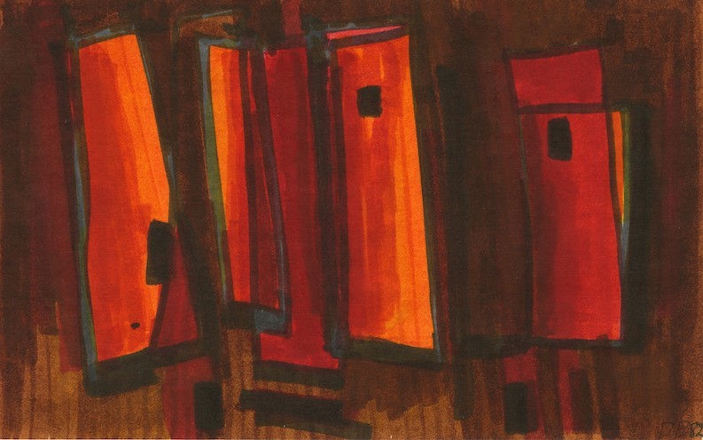
During the later years of her career Dusti Bongé was remarkably prolific. She created numerous smaller works on paper, in ink, watercolor, and felt tip pen, all in a dazzling range of colors and compositions. These all offer a great example of Dusti’s proclamation that she liked all colors.
In this next set of works each of the pieces could be considered to have a muted palette. They show how such a palette, what Dusti might have called “dull colors” can in fact result in a very richly hued composition. Dull in this context is definitely not boring or aesthetically unappealing. Quite the contrary, Dusti finds a way to make these colors almost luminous.
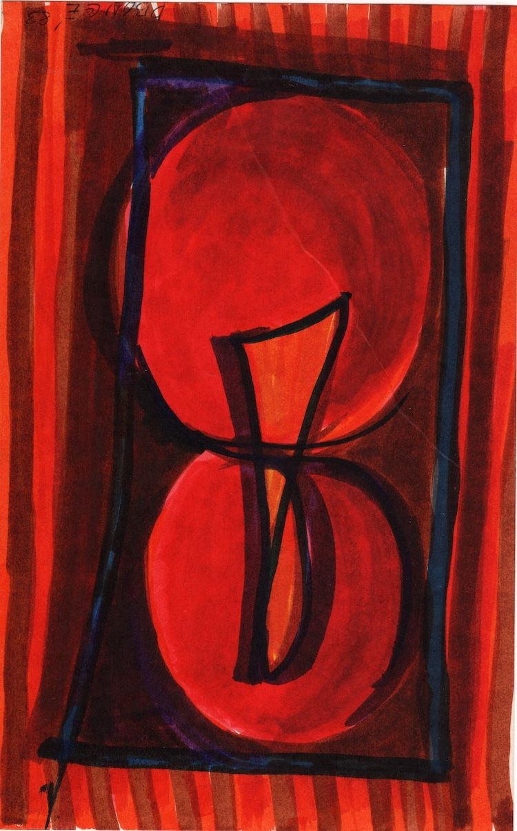
In this watercolor from 1983, the palette is largely dark, somber, and even cold. But not only is it dark, it is extremely limited as well. The only variation on the restricted use of a few dark hues is the bit of golden yellow Dusti just barely introduces into the whole. And yet, with these few colors she somehow maximizes the way they complement and enhance one another.
The composition features heavy black lines and circular marks on a blue-gray background, which varies from being predominantly blueish at the center to mostly gray along the top and bottom edges of the work. The golden yellow appears as a faint light trying to shine through the background wash and barely penetrating along the tiny cracks and edges of the black brush strokes. And yet, this minimal light lends an almost translucent quality to the work. As such, by adding those few hints of yellow Dusti’s transforms the somberly hued work into one with radiance.

Comments